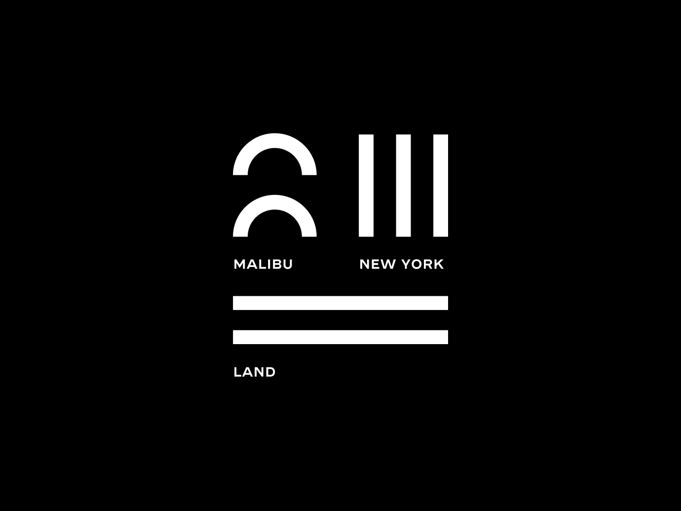
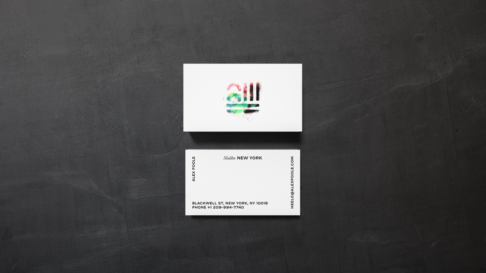
Malibu NYC

Scope:
Brand Design
Collaborators:
Michael Cina
Malibu New York is a solo design and technology studio that brings together two seemingly opposite worlds: the relaxed, tactile sensibility of California beach culture and the rigorous, urban energy of New York. Founded by an independent consultant with years of experience in design and technology, the studio extends a practice that has spanned product and furniture design, generative art, and bespoke digital solutions.
-
We anchored the identity in a single, meaningful element. In formal logic the upside-down A (∀) is the universal quantifier meaning “for all.” That symbol became the conceptual and visual core of the wordmark, signaling both the technical rigor of verifiable computing and the company’s mission to make it available to everyone. The wordmark itself is derived from Cina Sans, a contemporary typeface chosen because it balances modern precision with a bit of personality, avoiding sterile tech minimalism.
To give the brand energy and narrative depth, we paired the symbol and type with a deliberate color system and curated vintage photography. Color provides contrast and approachability; the photography injects character and optimism drawn from an earlier tech era rather than the current startup archetype.