Argument

Scope:
Brand Design
Web Design
Collaborators:
Michael Cina
Eric Hurtgen
Argument Computer Corporation exists to accelerate verifiable computing. Rather than sounding like a typical tech startup, the brand needed to communicate different goals and values: clarity, trustworthiness, and broad accessibility.
-
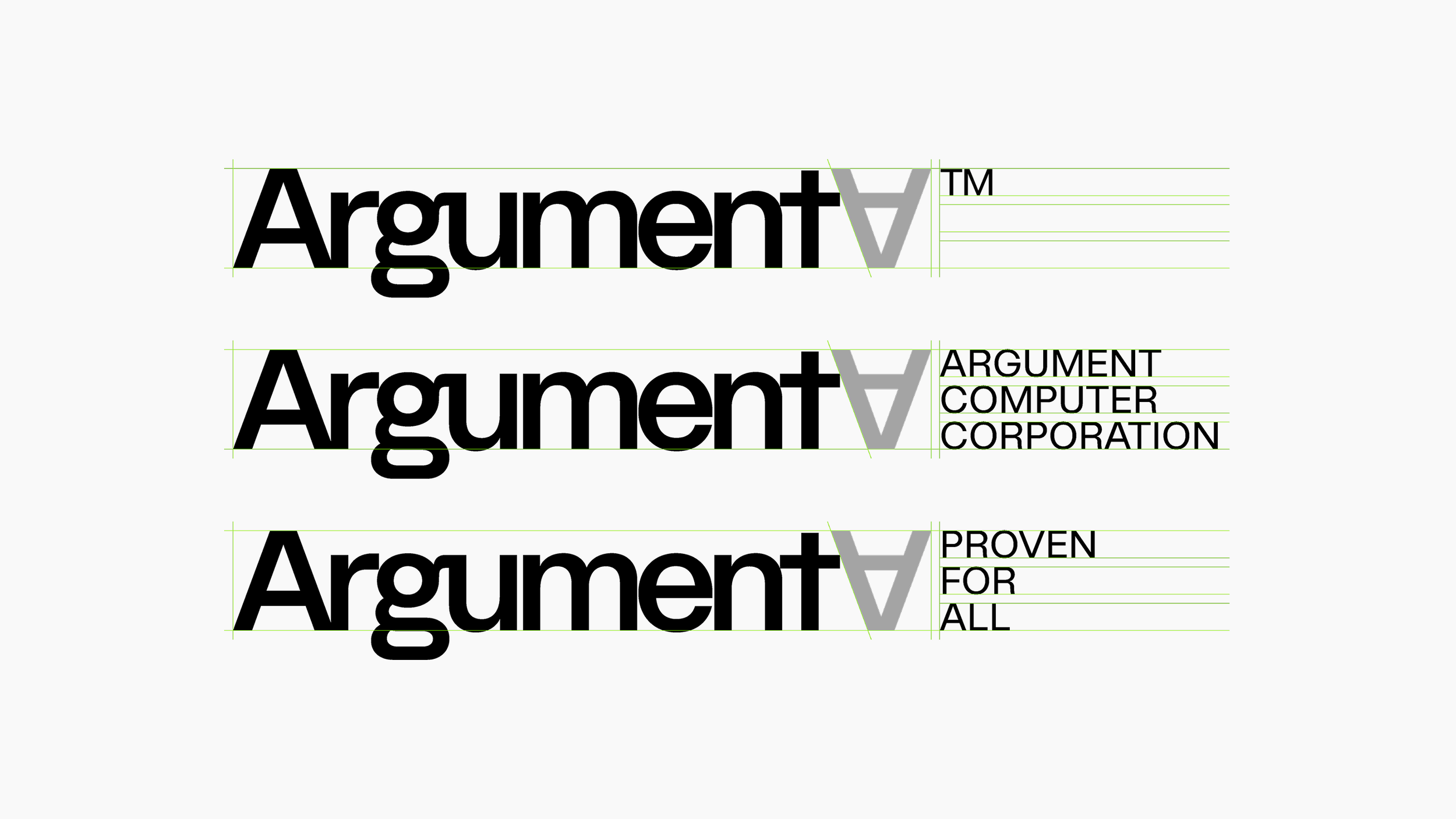
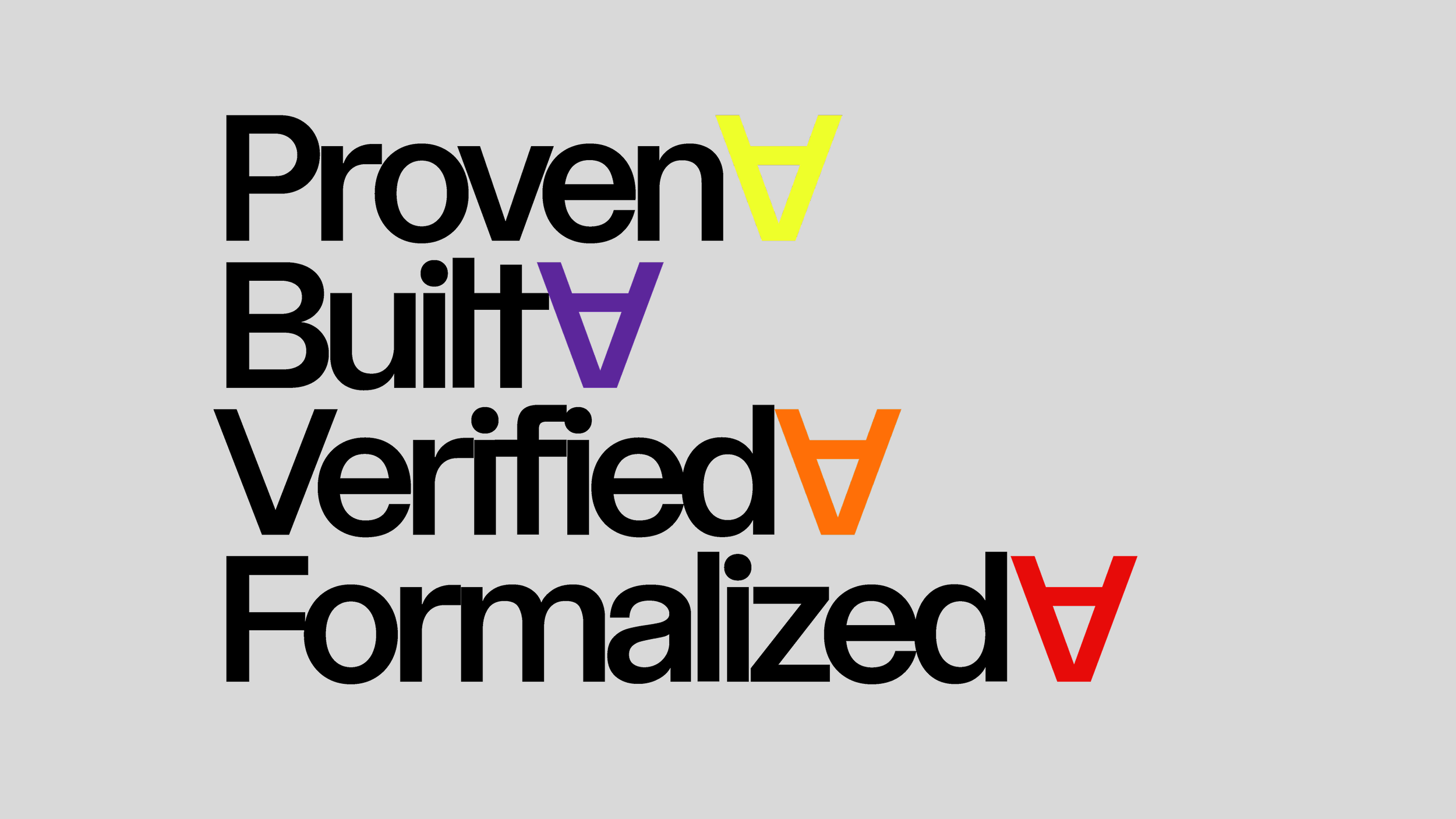
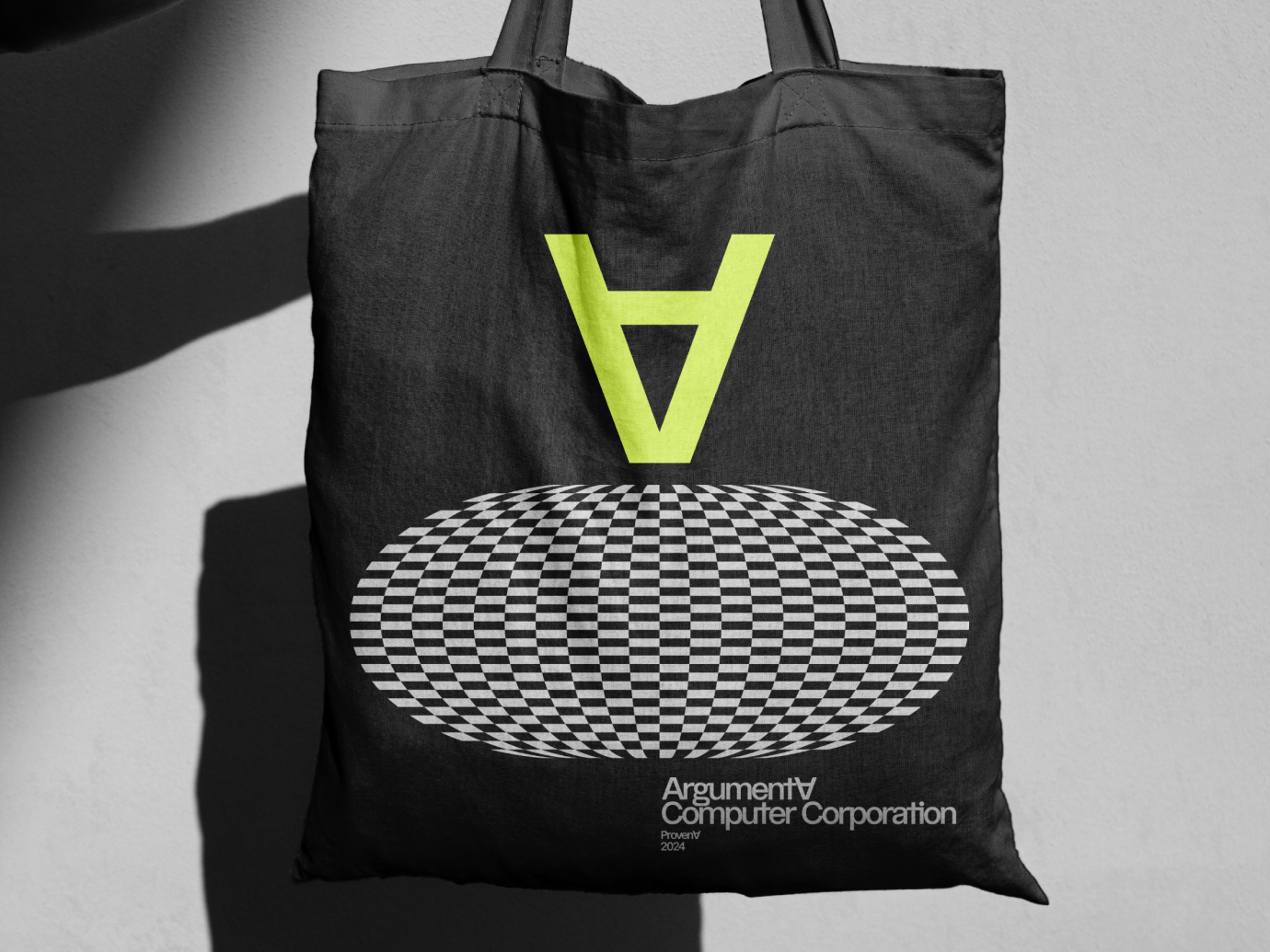
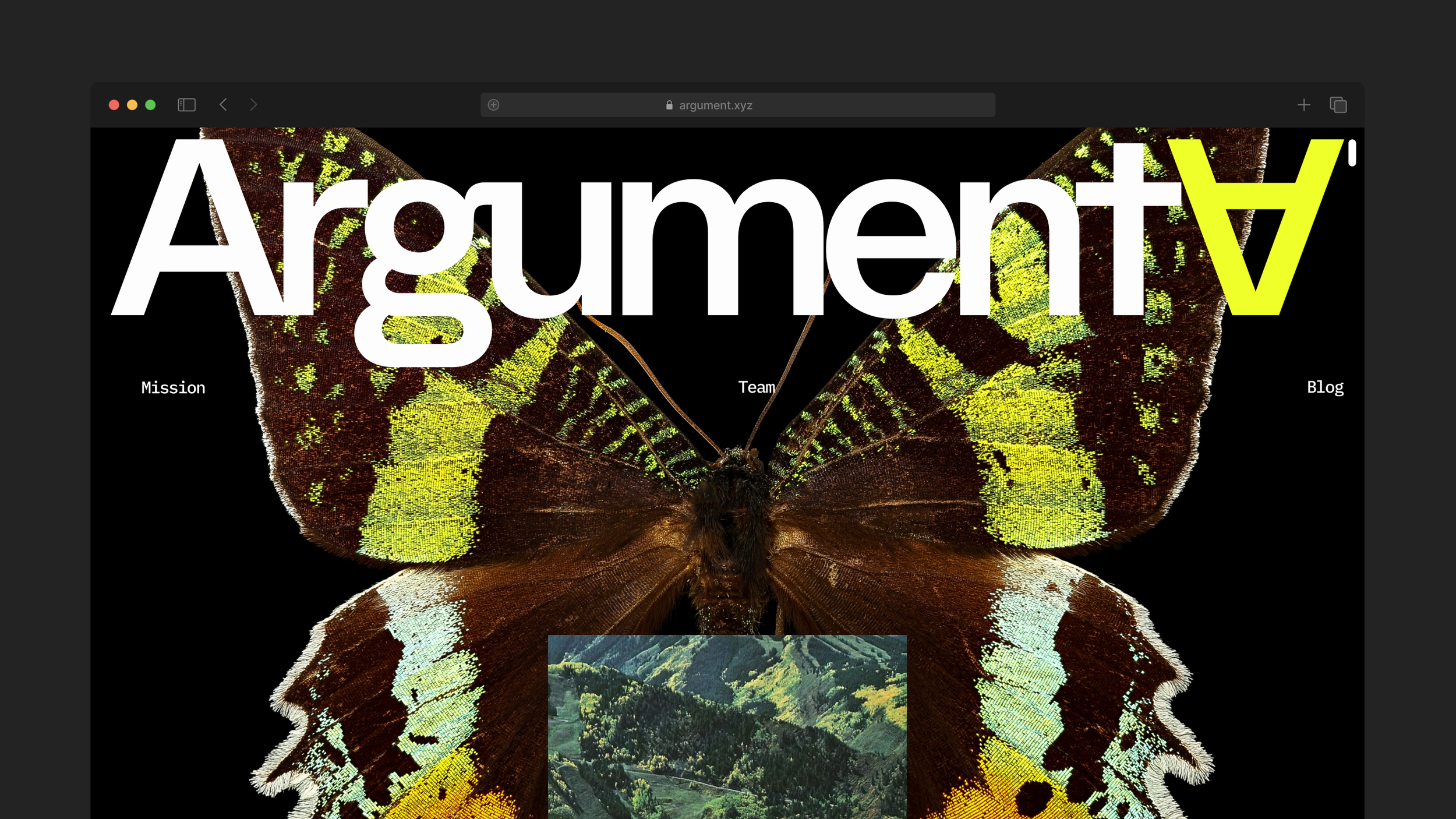
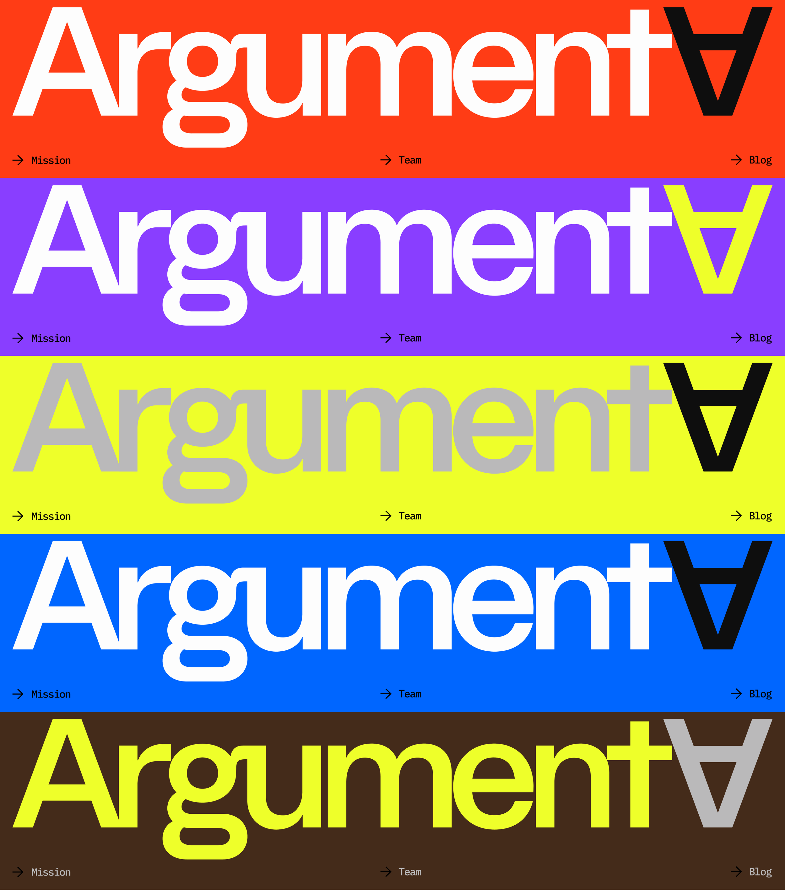
We anchored the identity in a single, meaningful element. In formal logic the upside-down A (∀) is the universal quantifier meaning “for all.” That symbol became the conceptual and visual core of the wordmark, signaling both the technical rigor of verifiable computing and the company’s mission to make it available to everyone. The wordmark itself is derived from Cina Sans, a contemporary typeface chosen because it balances modern precision with a bit of personality, avoiding sterile tech minimalism.
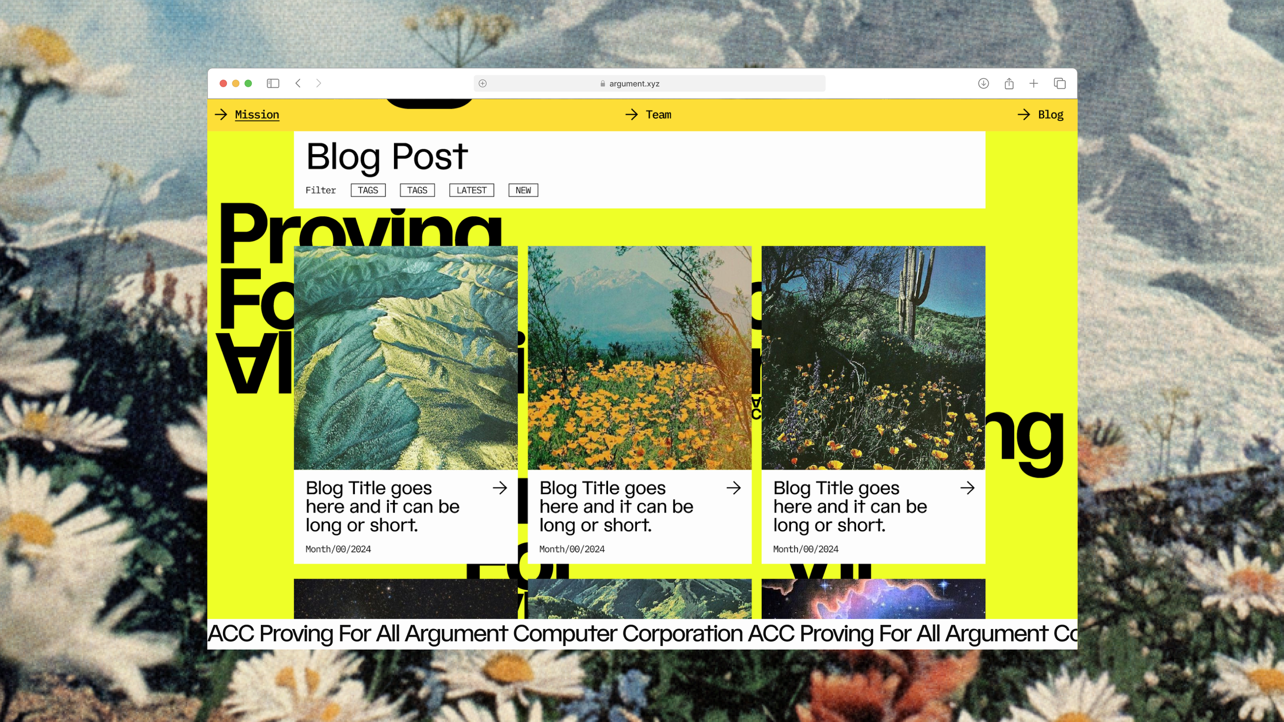
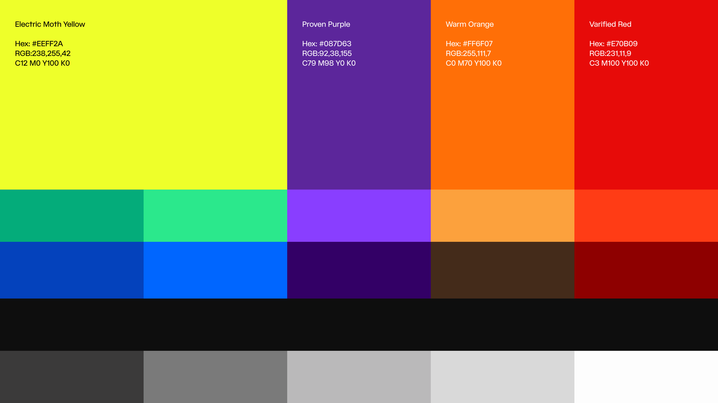
To give the brand energy and narrative depth, we paired the symbol and type with a deliberate color system and curated vintage photography. Color provides contrast and approachability; the photography injects character and optimism drawn from an earlier tech era rather than the current startup archetype.